
The Portfolio Paradox: Why Months of Design Work Disappear on Camera
You’ve been on that couch for six months. Marbles of Italy. Special brass bands. Fluted woodwork that took three weeks to put in.
Someone then takes a picture at eye level with a wide-angle lens and a flash. What is born? It looks like some rental ad. It’s not the design. It’s the documentation.
Real estate photography as we know it compresses premium surfaces into a two-dimensional record of furniture placement, compresses materials and bows vertical lines. Cinematic architectural photography does something else, entirely – it creates mood, scale and emotional resonance to make a prospect feel the space before they visit it.
The biggest mistake I see in architect-shot portfolios is shooting everything too wide and making the space look flat. In this showroom, I focused on clean lines, balanced framing, and showing how the space actually feels. Cinematic presentation usually gets more attention because it creates a sense of depth and helps the client imagine themselves in the space. I wouldn’t claim a fixed engagement percentage without actual campaign data, but the difference in presentation is clearly noticeable.
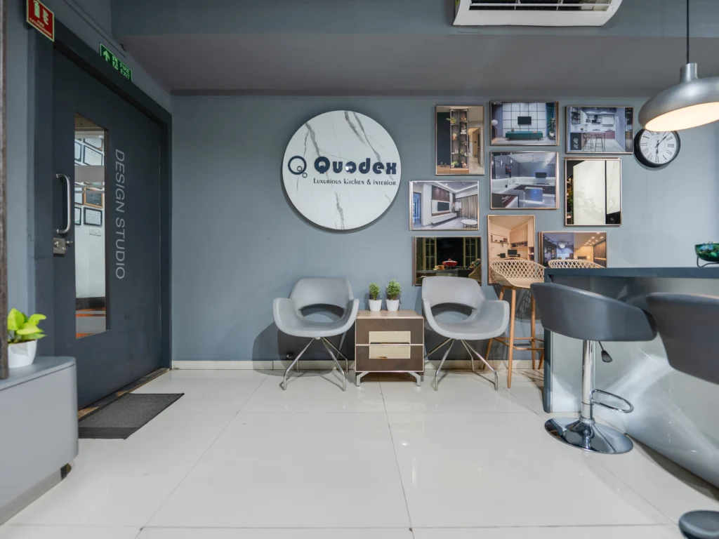
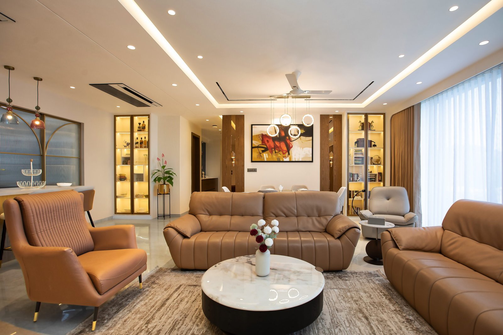
Quodex Interior Design Studio Showroom Photography
The 10-Minute Pre-Shoot Staging Protocol
Before the camera comes out, the room needs work.
The 30% Decluttering Rule. Remove 30% of decorative items from every surface — coffee tables, consoles, credenzas. Camera sensors amplify clutter. What looks fine in person looks chaotic in a 45-megapixel frame.
Steam everything vertical: Curtains, throws, cushion covers — all of it. Raking light makes every wrinkle visible.
Rotate accent chairs 15–20 degrees inward: toward the coffee table. It creates a conversational vignette rather than a rigid showroom lineup.
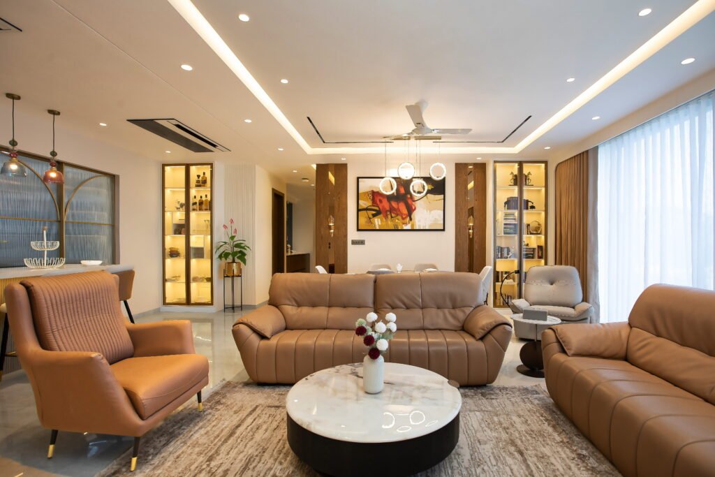
Cinematic Living Room Photography: Capturing Interior Design, Lighting and Spatial Details
On live residential shoots, I usually hide things like TV remotes, charging cables, extension boards, tissue boxes, small dustbins, loose wires, and personal items behind sofas or inside drawers. I also switch off visible fans and remove unnecessary table items before shooting. In this living room, the goal is to keep the frame clean so the furniture, lighting, and interior design become the focus. Camera Height & Focal
Length: Eliminating Distortion
Eye level is wrong. Always.
At 5.5 to 6 feet, the camera tilts downward, walls converge, and ceilings disappear.
The Waist-Height Rule: Lock the tripod between 36 and 48 inches. This keeps every vertical line parallel and balances ceiling and floor planes evenly.
Lens Selection:
- 24mm Tilt-Shift — Full hall establishing shots, zero keystoning
- 35–50mm — Natural perspective for seating zones and transitions
- 85mm Prime — Fluted panels, marble veining, bespoke joinery detail
Never go below 20mm. It bends sofas into trapezoids.
For a standard 9.5-foot ceiling, I usually keep the tripod around 4.5 to 5 feet high. It gives a natural eye-level perspective without making the furniture look too low. I prefer 35mm for designer portfolios because it keeps the proportions of sofas, walls, and furniture more natural. Ultra-wide lenses can make the room look bigger, but they often stretch the edges and distort the designer’s actual work.
Lighting Mastery: The Flambient Technique
Every Mumbai living room has the same lighting war.
5600K daylight from the balcony vs. 3000K warm interior LEDs.
Expose for the dark corners — the window blows out. Expose for the window — the room goes dark.
The 3-Frame Flambient Solution:
- Frame 1 (Ambient) — Expose for the room’s natural warm glow
- Frame 2 (Flash) — Bounce off the ceiling to neutralize yellow casts and reveal true material colors
- Frame 3 (Window Pull) — Expose specifically for the balcony view and city skyline
Blend all three in Photoshop using Luminosity Masks. Natural result. Zero fake HDR glow.
At 3 PM, I usually avoid fighting the direct sunlight. I pull the curtains or use a sheer layer to soften it, then balance the room with the existing lights. I also shoot a few bracketed exposures and blend them in post. This keeps the bright floor under control while retaining detail in the darker furniture and interiors.
Composing Cinematic Depth: Foreground, Midground & Symmetry
Flat compositions make every room look like a furniture catalogue.
Three-plane layering fixes this:
- Foreground — Soft-focus sofa arm, cushion edge, or floor lamp base
- Midground — Hero seating cluster, coffee table, area rug
- Background — Feature wall, sconces, sheer curtains
The One-Point Symmetry Shot: Center the lens along the room’s primary axis -center of the TV unit or center of the sofa. It creates an editorial, architectural statement that standard photography never achieves.
In a 200 sq.ft. living room, I keep a plant leaf or chair slightly in the foreground, close to the lens, rather than placing it directly in the main frame. I shoot around it with a 35mm lens and keep the foreground slightly soft. It creates a natural frame and adds depth without making the small room feel crowded.
Capturing Open-Plan Living & Dining Halls
Wide open halls are the hardest spaces to photograph well. Without a clear strategy, the dining table and the living sofa compete chaotically in the same frame.
The fix: Position the camera at the transition threshold — the dining area edge looking toward the living zone. The spaces read separately but connected. Use ceiling coves, linear floor borders, and furniture backs as leading lines that guide the eye from the entryway into the lounge.
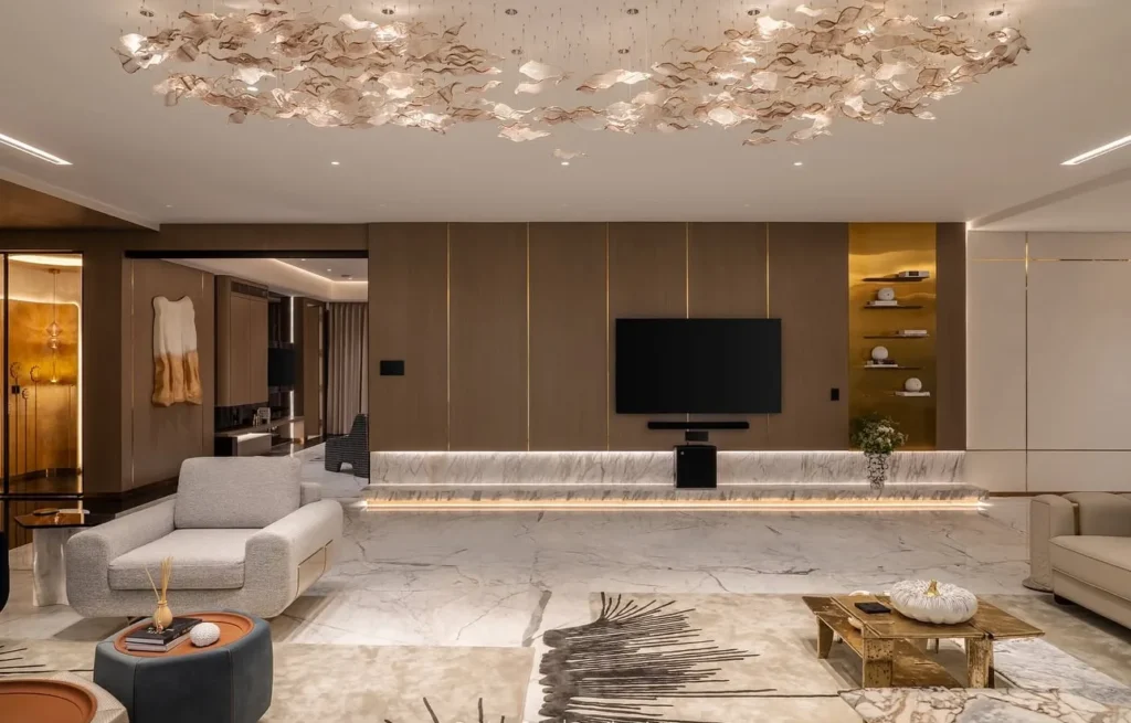
Luxury Hall Photography: Using Light, Composition and Architecture to Create a Cinematic Interior
When shooting down the length of an open apartment, I first move the dining chairs and sofa slightly out of the main sightline. I keep chairs evenly spaced, hide loose cushions or remotes, and avoid having furniture overlap too much. I also lower the camera and use a wider lens carefully, so the room feels open without making the furniture look crowded.
Cinematic Video Walkthroughs: Motion & Gimbal Work
Shaky smartphone pans kill luxury perception immediately.
Three essential living room video moves:
- The Entryway Push-In — Smooth forward glide from the foyer revealing the room as a guest would see it
- The Lateral Counter-Slide — Slow horizontal movement tracking behind an accent chair, revealing the media unit
- The Coffee Table Orbit — Subtle low-angle rotation around the styled table highlighting materials
Always shoot at half human walking speed. Slow movement signals luxury.
Shoot at 24fps for cinematic pacing or 60fps for half-speed slow motion. Leave 2-second static handles at start and end of every move.
For 9:16 Instagram clips, I frame vertically from the start instead of cropping a horizontal shot later. I leave some space at the top and bottom for Instagram’s text and UI, and keep key elements like artwork, lights, and furniture inside the centre safe area. I also make a few slow vertical movements so the full design is visible without cutting off important details.
The Material Macro: Showcasing High-Ticket Textures
Wide shots show scale. They cannot justify a ₹40,000 per sq.ft. design fee.
Switch to 85mm at f/2.8–f/4 and move close.
Position light at a grazing side angle — raking light casts micro-shadows across surfaces, making wood grain and stone fissures visible.
Capture interaction shots:
- Hand touching a stone ledge
- Soft-close drawer gliding shut
- Dimmer switch illuminating a sconce
These are the frames that make prospects save, share, and call.
In my interior shoots, natural stone, wood grain, fluted panels, textured walls, and fabric upholstery usually get the strongest response. I make close-up detail shots along with wider room shots, especially when the light catches the texture. These images help clients understand the quality of the materials and often create more interest than a standard wide-angle room photo.
Field Notes from Mumbai Residential Shoots
- What is your standard protocol for shooting living rooms in high-rise towers where the sea-facing balcony creates severe haze?
My usual approach is to shoot slightly away from the balcony glass and keep the interior exposure controlled. I use a tripod, bracket a few exposures, and keep the balcony and sea visible without letting the highlights blow out. If the haze is heavy, I shoot earlier or later when the light is softer and recover the exterior detail in post.
- How do you handle tight 200–250 sq.ft. living rooms in older Mumbai societies without fisheye lenses?
I avoid fisheye and extreme ultra-wide lenses because they distort the furniture. I usually work around 24–35mm, keep the camera straight and at about 4.5–5 feet, and position it carefully in a corner or doorway. The idea is to make the room feel spacious while keeping the actual proportions natural.
- What has been your most dramatic transformation where camera positioning completely disguised a structural beam or awkward column?]
One of the biggest improvements comes from simply changing the camera position. I’ve had rooms where a beam or column looked very obvious from the doorway, so I shifted the camera sideways and used furniture or a foreground element to break the visual line. The final frame made the structure feel like part of the composition rather than an obstruction.
The Ultimate Living Room Shoot Day Checklist
| Phase | Action | Standard |
| Pre-Shoot | Window glass & balcony railings | 100% free of watermarks |
| Pre-Shoot | AC remotes & cords | Stowed inside drawers |
| Lighting | Bulb temperature | Uniform 2700K–3000K |
| Lighting | Ceiling spot dimmers | 15–20% output only |
| Staging | Curtains & soft furnishings | Steamed flat |
| Staging | Area rug alignment | Zero curled edges |
| Camera | Tripod height | 38–44 inches strictly |
| Camera | Vertical line lock | 0.0° digital horizon |
| Deliverables | Shot coverage | 1 wide hero + 2 corners + 4 macros + 2 reels |
Your Design Deserves Visuals That Match It
Your design work is only as valuable as the imagery representing it in the market.
In Mumbai’s competitive architectural and interior design landscape, magazine-grade visuals aren’t a luxury — they’re the difference between inquiries at your target fee and inquiries from clients who want a discount.
Cinematic360 produces cinema-grade living room photography and video walkthroughs for architects, interior designers, and luxury developers across Mumbai — from South Mumbai heritage apartments to Worli high-rises and Bandra penthouses.
Schedule a Living Room Shoot Consultation with Cinematic360
Explore our real estate photography, commercial photography, and interior shoot packages to see the approach in action.
Frequently Asked Questions
Why can’t I use my phone for my interior design portfolio?
Smartphones distort proportions, bend vertical walls, and blow out window light. Tilt-shift lenses and Flambient lighting preserve exact scale, straight lines, and true material colors.
Best time of day to shoot a living room?
East-facing: 9AM–11:30AM for soft non-glaring light. West-facing: blue hour just after sunset — 3000K interior light balances against the deep blue exterior sky.
How many images should an architect expect from a living room shoot?
6 to 10 curated images: 1 wide establishing shot, 2 diagonal angles, 2 vignette mid-shots, 3–4 macro detail captures.
How do you shoot a dark living room with no natural windows?
Bounce softboxes off walls to mimic window spill. Turn on all practical lamps. Shoot at low ISO (100) with long tripod exposures (1–3 seconds).